On the palette of Blood Oranges, Blossom, and the conversation between sage, ochre, and ruby red.
Some paintings are about a subject. This one is about a conversation between colors. Blood Oranges, Blossom began not with the vase, or the fruit, or the branch of white flowers, but with a question: what happens if you put a cool, dusty sage beside a burning red-orange? Not the red of a tomato, not the orange of a traffic cone, but the deep, almost bloody red-orange of a citrus fruit split open. The kind of color that looks like it has a pulse.
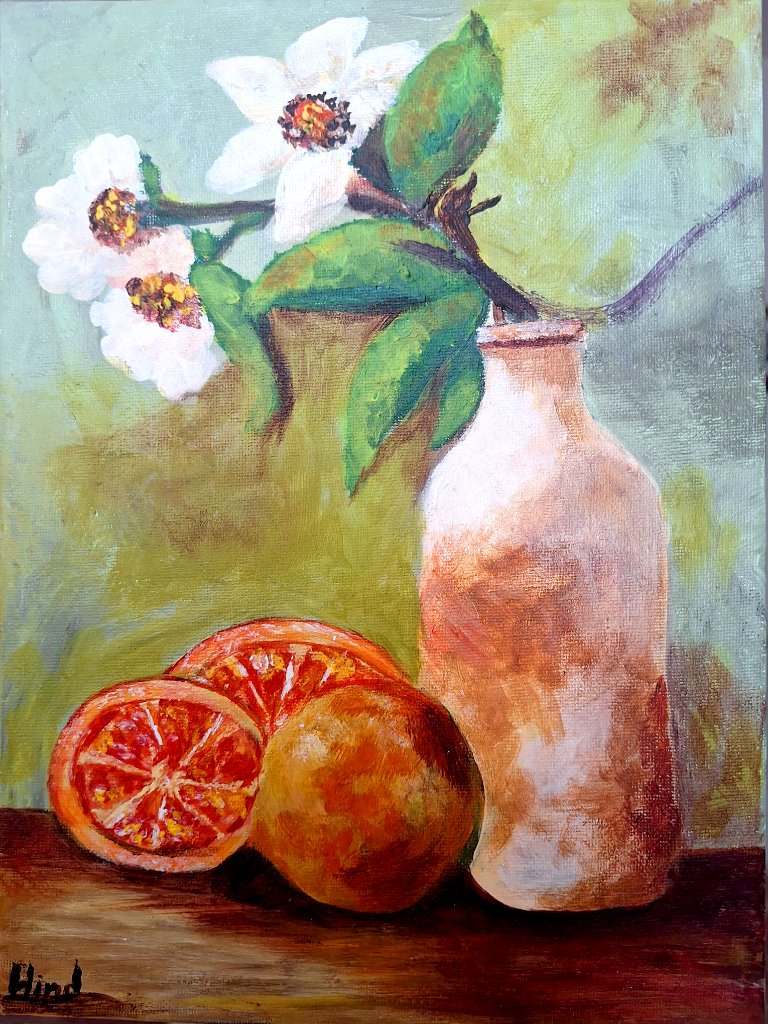
The background is the first decision the painting makes. It is a wash of sage and olive green, soft and slightly chalky, like an old plaster wall in a Tikrit courtyard after rain. This green does not compete. It sits back, holds its breath, and lets the foreground do the talking. Green is the listener of this composition. It is the color of patience.
Against that patient green, the vase rises in tones of terracotta, cream, and beige. It is an unglazed clay bottle, the kind found in any Iraqi kitchen. There is no shine on it, no glamour. The palette here is earthy and grounded: think of mud walls dried in afternoon sun, of unglazed pottery held in two hands. These warm neutrals are the painting's spine. They hold everything else up.

Then the fruit arrives. Two blood oranges, one whole, one halved. The whole one carries golden-brown and burnt-orange tones, the color of late afternoon light hitting a mud-brick wall. But the halved orange is where the painting raises its voice. Here the red is deep, almost crimson, with a vibrancy that pulls the eye and does not let go. It is the focal point, the single hottest note in the whole composition. Against the sage background, the red-orange vibrates. This is complementary contrast at work: green and red-orange, set side by side, make each other more alive.
And then, almost as an afterthought, the blossom. Three white petals on a branch, leaning from the neck of the vase. White in this painting is not a void. It is a color with weight. It is the cool counter to the heat of the oranges, the same way the sage is the cool counter in the background. The painting uses white the way a sentence uses a comma: to let the eye rest before it goes back to the fire.

The tabletop ties it all down. A dark, rich brown, almost black in the shadows, it acts like the root of the painting. Without it, the composition would float. With it, everything has a floor to stand on. The brown carries echoes of the terracotta vase, so the warm tones form a chain: brown table, terracotta bottle, burnt-orange fruit, crimson flesh. A single warm family, moving from dark to light.
What makes this palette work is not any single color, but the tension between two families. The cool family: sage, olive, white. The warm family: terracotta, burnt orange, crimson, brown. The painting lives in the space where they meet. The sage cools the red. The red warms the green. The white blossom, caught between them, belongs to neither and holds both. This is the whole argument of the painting, and it is carried entirely by color.
I have always thought of color as a language, not a decoration. In this piece, the palette says something I could not say in words: that the ordinary things in an Iraqi kitchen, a clay bottle, a few oranges, a branch forced into bloom, can hold a whole spectrum of feeling. Sage and crimson. Patience and pulse. The ordinary, it turns out, is enough.